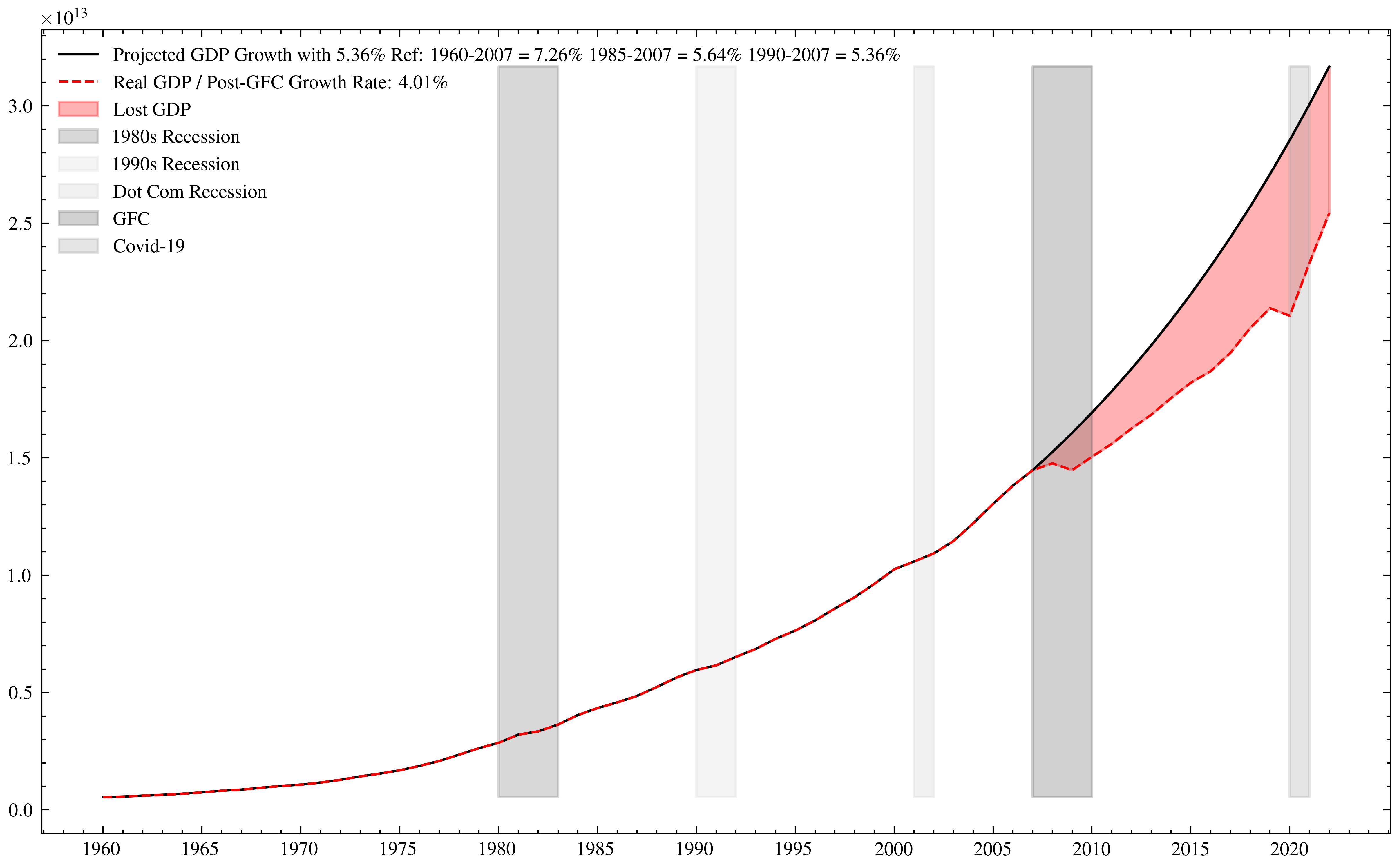
One of the most striking calculations I have been doing in a while was graphically visualise the difference in GDP in the US (an the rest of the world) since the GFC.
Missing GDP in the US since 2008
Plotting the GDP shows a significant deviation from trend. In the image above what you can see is that the US had an L-shaped recovery since 2008, with the actual produced GDP far underperforming given the previous trendline set since the beginning of the Eurodollar system.
This is undoubtably a major issue. And it is an even worse picture, when looking at it from an international standpoint.
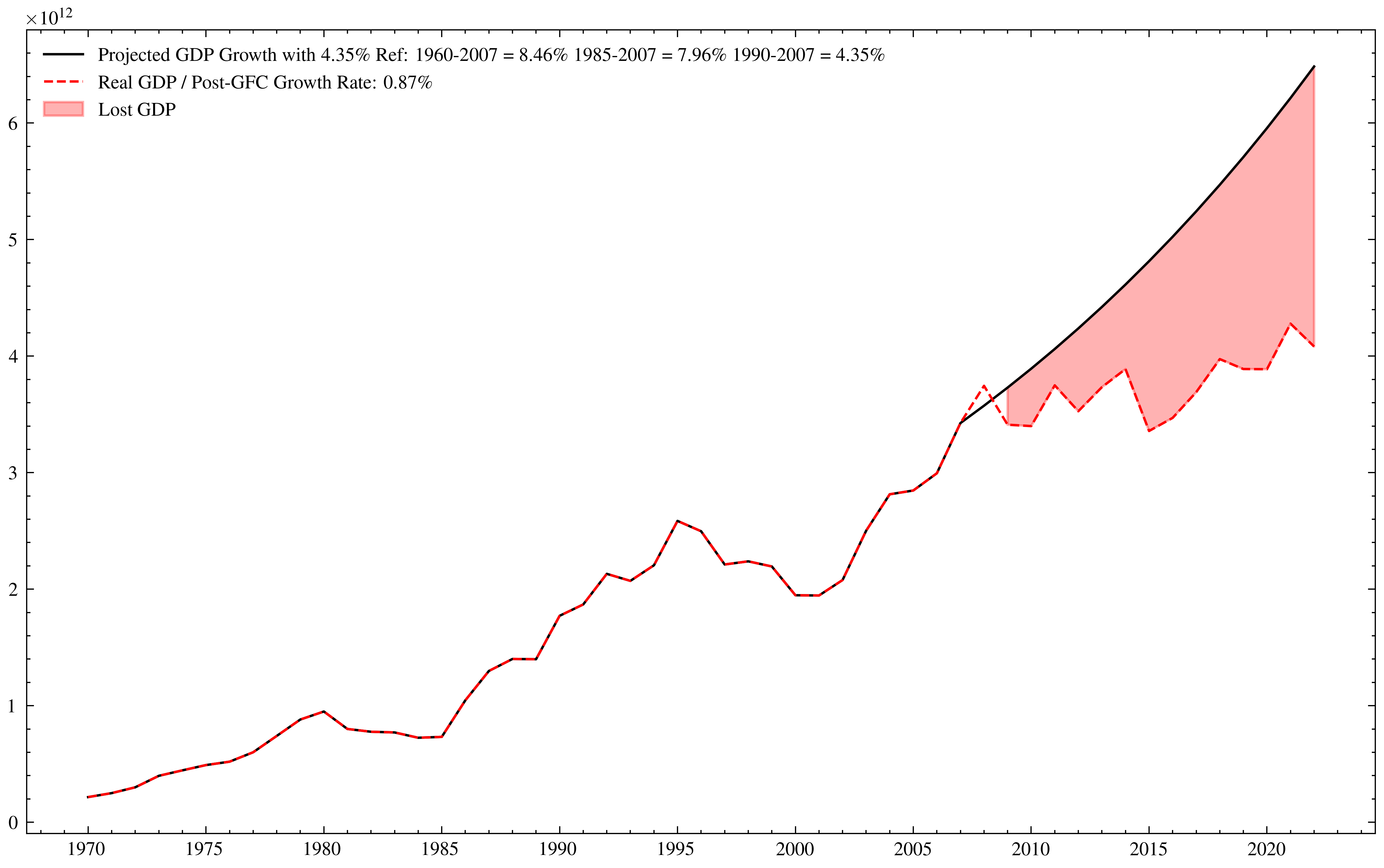
Look at the graph that the German GDP produces.
Missing GDP in Germany since 2008
I do not wonder anymore why crazy politicians pop up in Germany any more.